Red Cross Annual Report - Logo Design

Red Cross Annual Report and Greeting Card Design

Red Cross Annual Report Cover Design

Red Cross Annual Report Layout Design

Red Cross Annual Report Greeting Card Design
香港紅十字會年報設計
Red Cross Annual Report Design
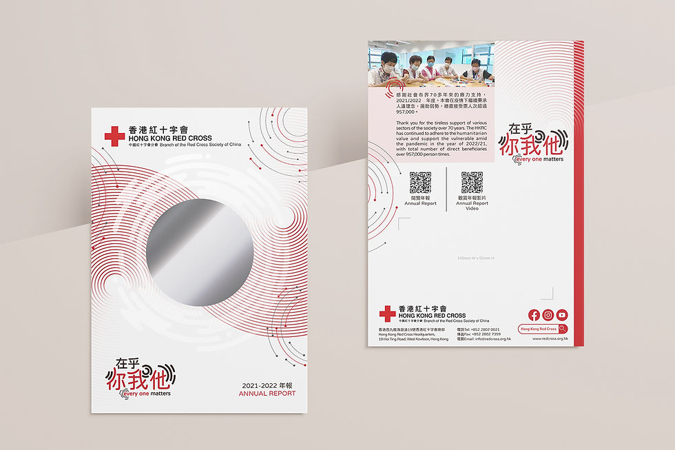
每個人都是善樂的源頭,能引發「漣漪效應」。我們運用漣漪的圖像作為設計元素,呼應主題 "Every One Matters"。我們每個人就像漣漪的中心,發揮自己的影響力,慢慢延伸開去,把大家連繫在一起,互相影響,為社群推廣善樂。
年報封面中間的圓形位置設計成鏡面效果,讓讀者可以看到自己的影像在漣漪的中心,象徵著我們每個人都能發揮影響力。而圓形外圍的漣漪圖案,利用印刷工藝 SPOT UV 的透明反光效果,表達出水的感覺。
整個年報的設計充滿不同形態的漣漪元素,為香港紅十字會打造了一個凝聚滿懷人情味的設計方案。
We all have the power to spread kindness and happiness, like the ripples created when a stone is thrown into water. That's why we incorporated the image of ripples into our design for the annual report, in line with the theme "Every One Matters". Just as a stone creates ripples that spread outwards from its center, each of us can have an impact that extends beyond ourselves, connecting us to others and promoting kindness and happiness in the community.
The center of the annual report cover features a circular area with a mirror effect, allowing readers to see their own reflection at the center of the ripples. This symbolizes that each of us has the ability to make a difference in the world, no matter how small our actions may seem. The ripple pattern on the outer circle is created using a SPOT UV printing process, which gives it a transparent and reflective effect that evokes the feeling of water.
Throughout the annual report design, we incorporated different forms of ripple elements to create a cohesive and emotionally resonant design for the Hong Kong Red Cross. By using this imagery, we hope to inspire readers to recognize the power they have to make a positive impact in the world, and to join us in spreading kindness and happiness to everyone around us.
Project includes:
年報設計 Annual Report Design
平面設計 Graphic Design
排版設計 Layout Design
project time: 2022
client: Hong Kong Red Cross
